


What is ASBL?
ASBL (Ashoka Builders India Pvt. Ltd.) is a Hyderabad-based real estate company known for delivering modern,
high-quality residential projects with a focus on thoughtful design and timely execution.

Wait… UI/UX for a real estate company? Yup!
Despite being in real estate, ASBL is incredibly tech-driven—every click on their platforms is tracked, and every process is systemized. Their product team manages three powerful B2B tools: Leads, CRM, and Progress.
Leads
Tracks potential customers’ behavior.
Once a user shares their phone number, lead executives follow up. If the user books a flat, their profile is handed off to the CRM.
Progress
Used by Construction teams to monitor construction status, project milestones, and timelines—ensuring what’s promised is built, tracked, and delivered on time.
CRM
Where the real action begins. This system helps executives manage applicant details, collect payments, track task progress, and coordinate documents—all the way until flat handover.

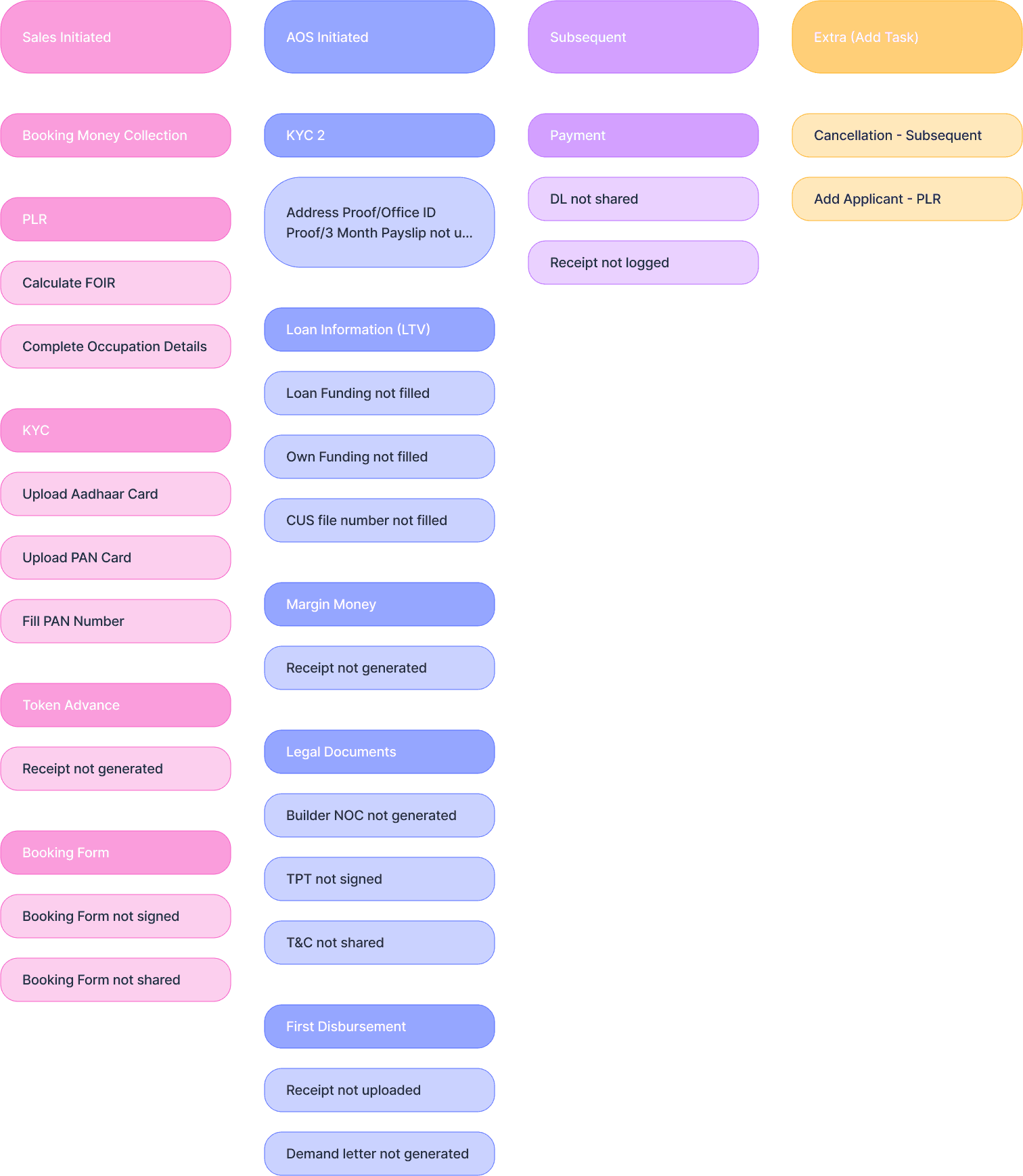
Project Brief
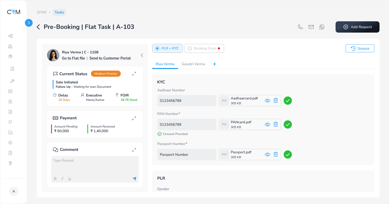
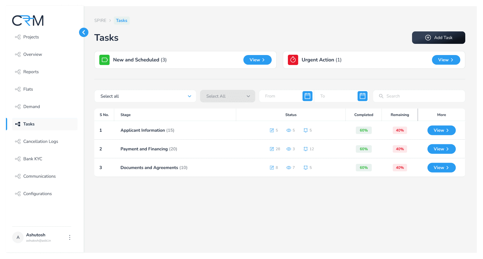
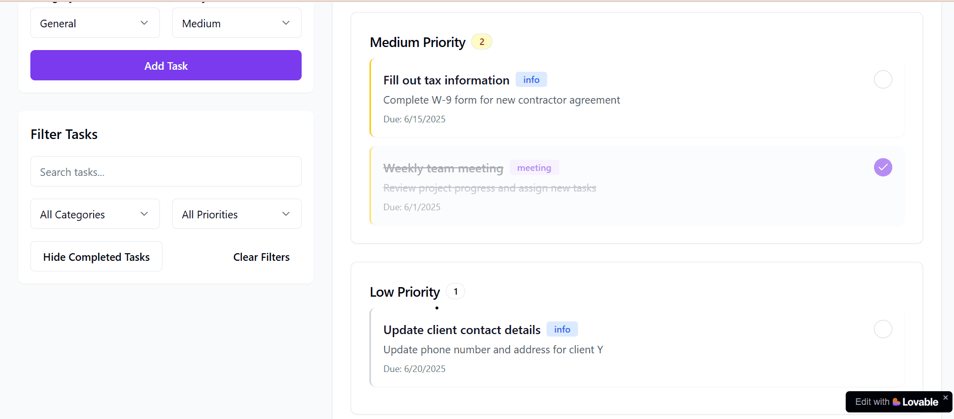
Tasking screen in CRM portal to help executives clearly see all their tasks and know which ones need attention first.
This tool simplifies their daily workload by giving them an organized view of tasks without changing the existing process.
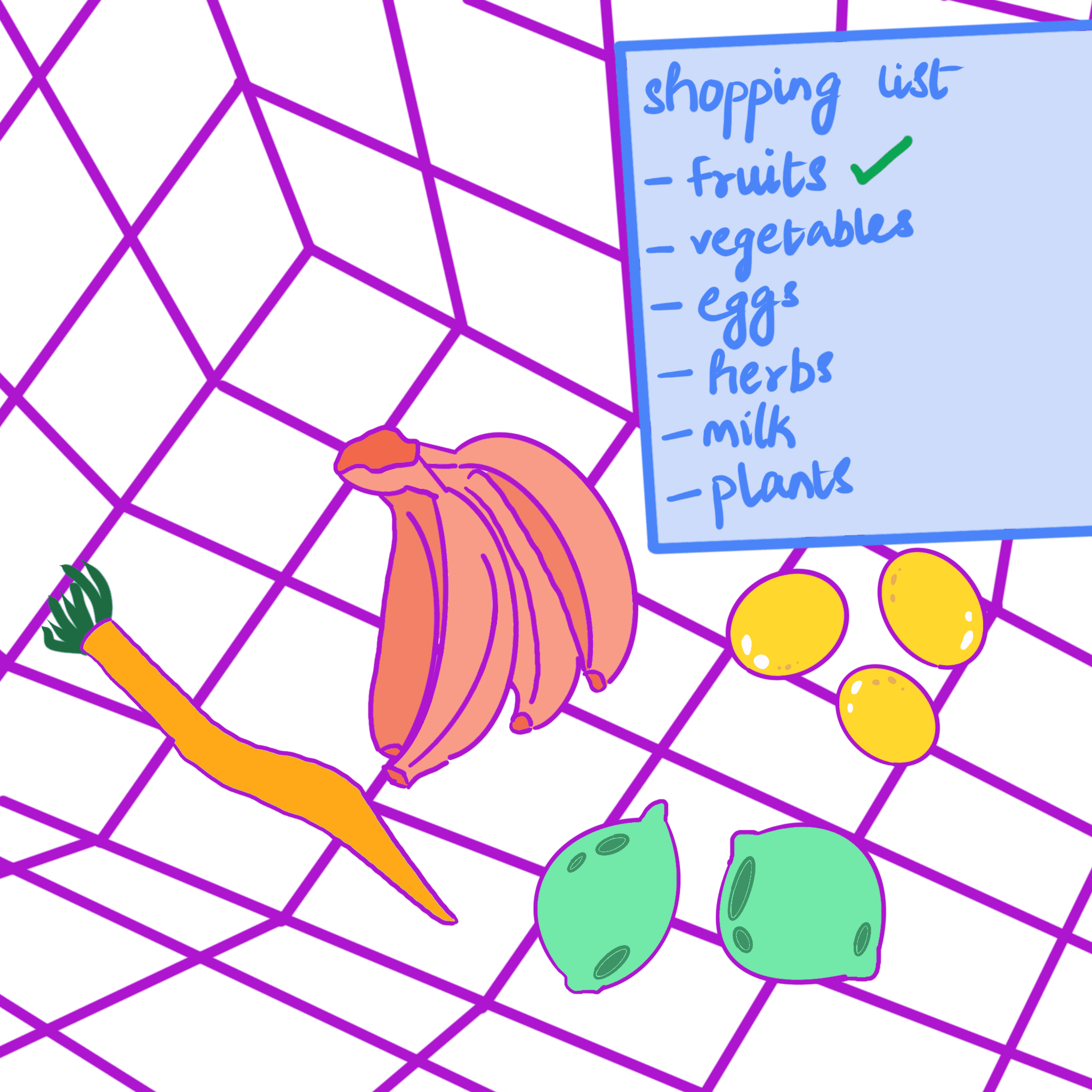
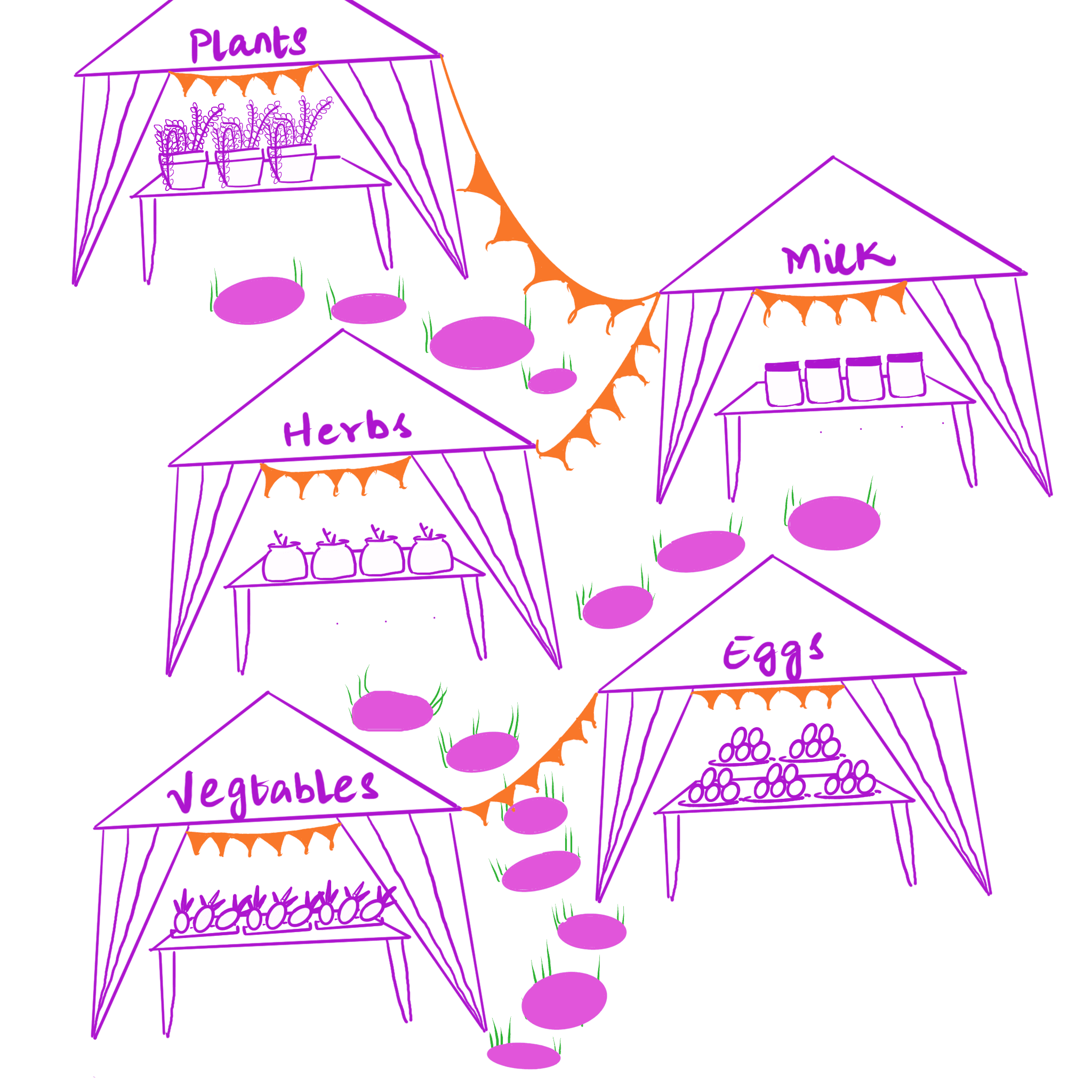
Imagine this: You’ve got a long shopping list, and you find yourself at the market like...

Project Timeline
The project timeline revolved around gathering continuous feedback from stakeholders and ensuring that the concept aligned with the goals and vision of both the product and design teams. Instead of focusing on rapid delivery, the emphasis was on laying a strong foundation for future development. - write something like this but for tasking
Solution
Tasking screen in CRM portal to help executives clearly see all their tasks and know which ones need attention first.
This tool simplifies their daily workload by giving them an organized view of tasks without changing the existing process.
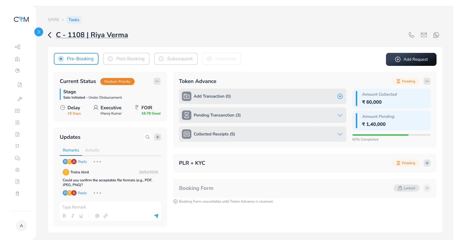
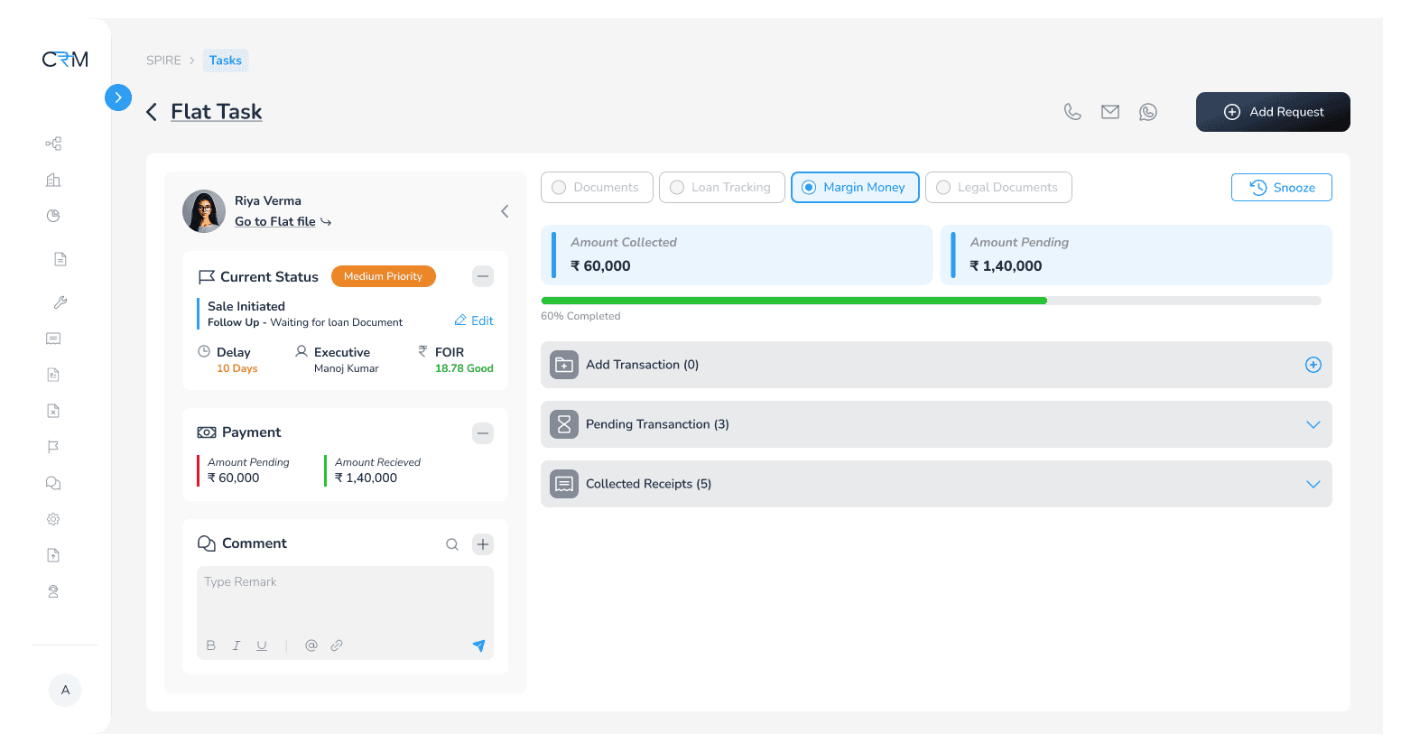
Centralized Task
Dashboard
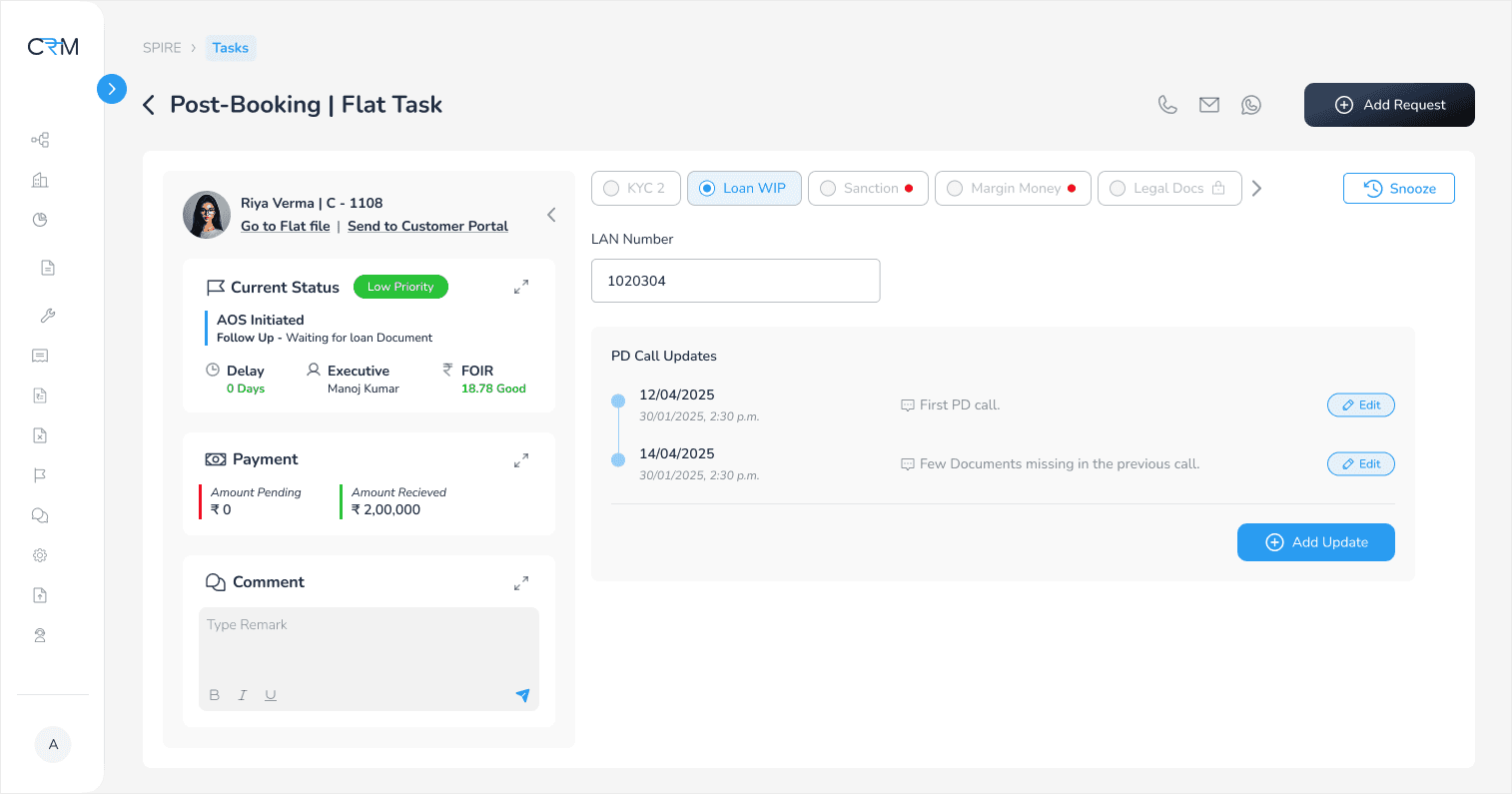
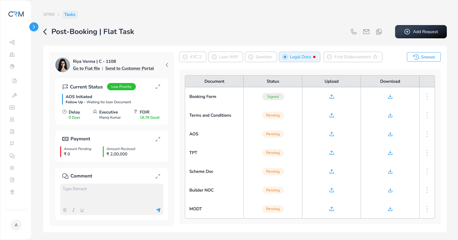
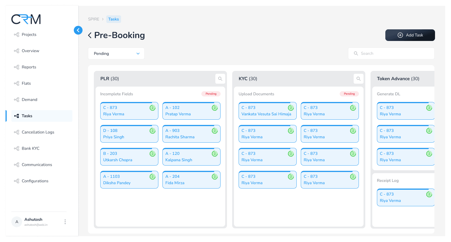
Created a unified screen where executives and managers can see all their assigned tasks across flats in one place, reducing confusion and improving visibility.
Priority-Based Task Indicators
Added visual badges to each task card to indicate urgency or importance, helping users identify what needs immediate attention and plan their day better.
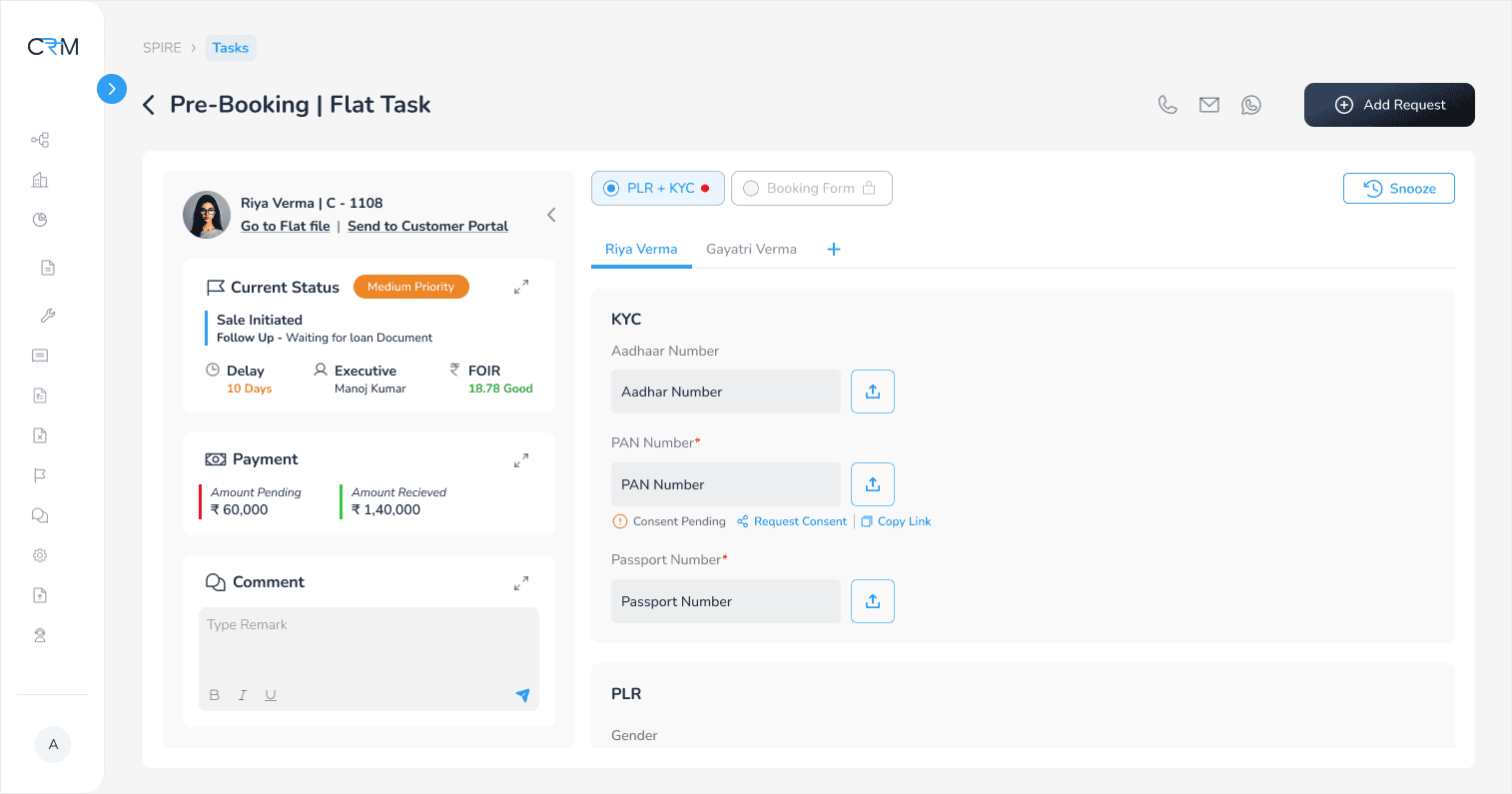
Quick Actions for Task Management
Allowed users to take key actions—like snoozing reminders, directly from each task, making task handling faster and more efficient.
Initial Task Breakdown and User Flow

First Attempt
Brainstormed Screens and Final Design


Why this design didn’t work?
The initial flow was designed to be linear—ideal in theory. But in practice, executives don’t always follow a fixed sequence. Considering real-life edge cases, delays, and exceptions, the flow needed to be more flexible and adaptive.
Refining the Brief
The initial idea was simple: A tasking screen in the CRM to help executives view and prioritize their tasks without disrupting the existing process.
However, as the project unfolded, the real need surfaced—not from the executives, but from the product team. Executives were comfortable with the current way of working. But the system needed to evolve to support better tracking, prioritization, and efficiency at a structural level. The brief shifted to designing a dynamic, scalable tasking system that surfaces priority-based actions—regardless of how rigidly the executives follow the flow.
Back to the Drawing Board!
New Brief
Tasking screen in the CRM portal designed not just for executives, but to help the product team streamline task handling.
This tool organizes actions dynamically, prioritizes what matters most, and aligns with real-world workflows—without changing the existing process.
Refined Solution
Secondary Research
Since the product was being designed internally, primary research was limited. To support design decisions, I conducted secondary research, formed hypotheses, and leveraged AI tools to deepen insights and validate assumptions.
Prioritization Logic
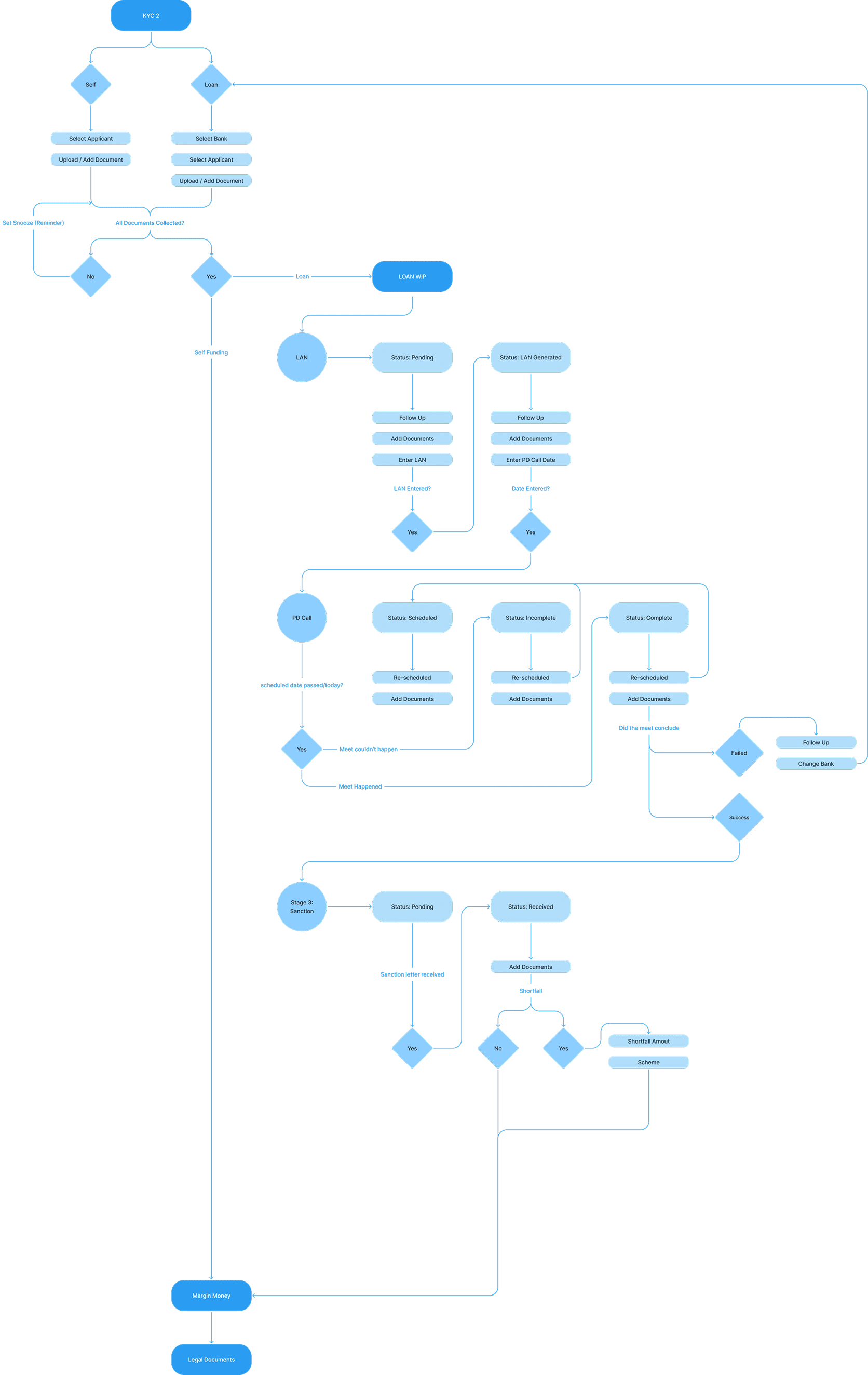
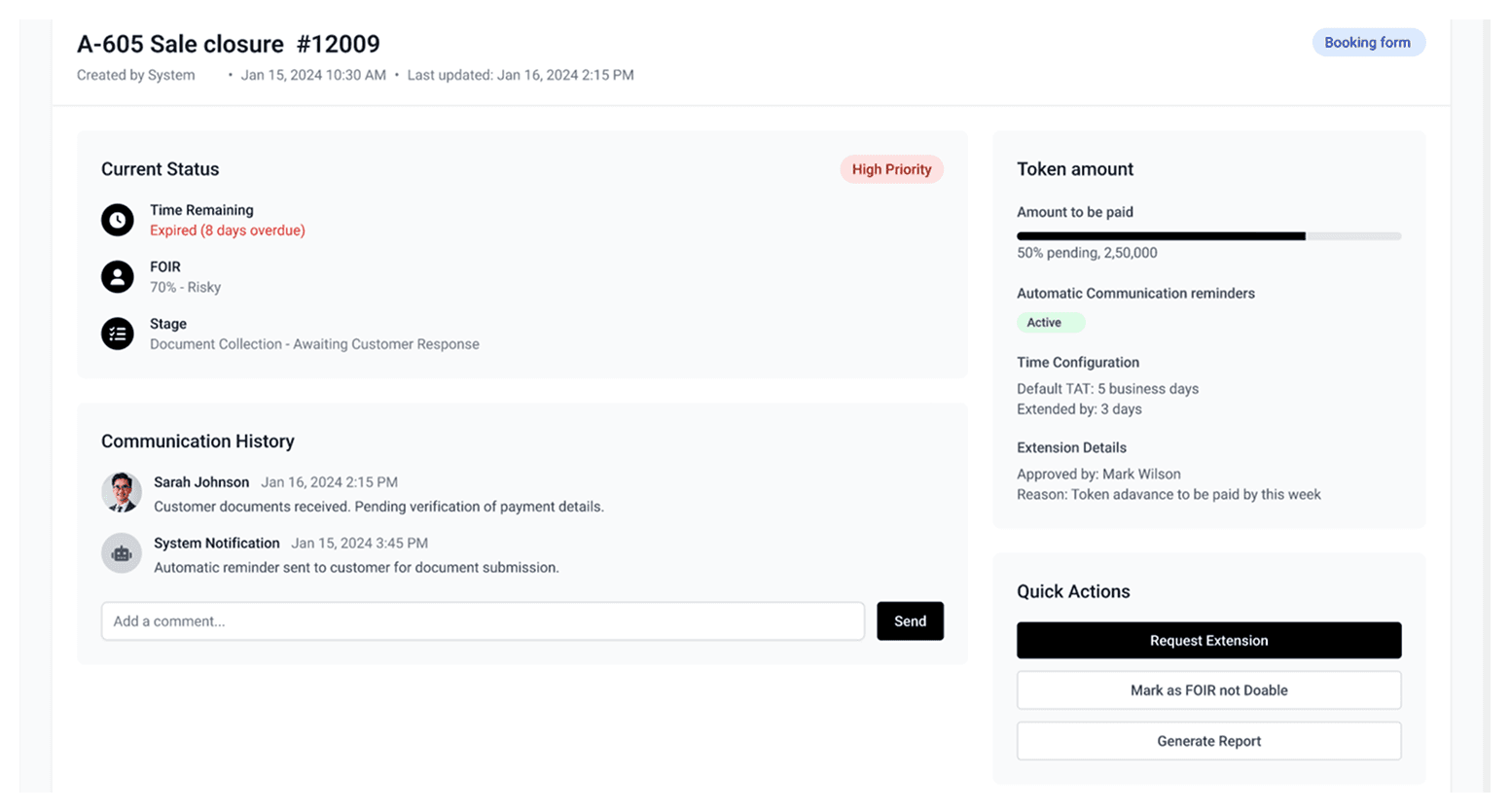
To ensure the right tasks surface first, we defined a backend logic based not on how much of the work is done, but on what critical step is still pending.
How it Works
The system checks for the most crucial pending task in a given stage.
If, for example, all other tasks are done but payment is pending, the system doesn’t mark it "almost done"—instead, it evaluates how long the delay has been.
A threshold-based system is used:
High Priority: Pending for more than 20 days
Medium Priority: Pending for less than 20 days
Low Priority: Only minor/informational steps remain
This logic ensures that delays in critical steps like payments are surfaced first, even if other surrounding actions have been completed.
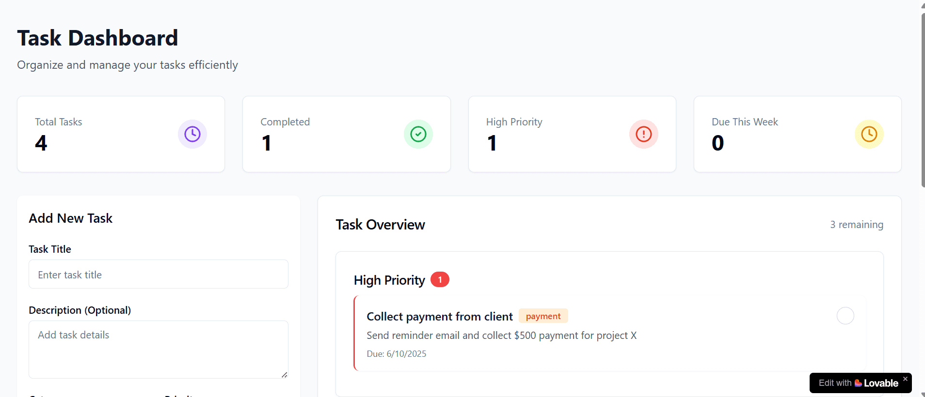
Final User Flow + Brainstorming with Lovable AI


Conclusion
This project was not just about creating a tasking screen—it was about understanding the real gaps in workflow and designing a system that could adapt to the unpredictable nature of executive operations. By balancing product needs with practical behavior patterns, and using tools like Lovable AI for quick ideation and validation, the final outcome was a flexible, prioritized, and scalable solution. It laid the groundwork for smarter task handling in ASBL’s CRM ecosystem.
